More familiar tabs for your users in Xamarin.Forms
Amongst the great variety of out-of-the-box pages that Xamarin.Forms has to offer, we can choose a TabbedPage wich is nothing else than a container to other pages, making them accesible trough tabs. You probable have used them and, as me, you think they are awesome, what it is not so awesome is the fact that they are somewhat limited as they do not allow so much customization.
That is why I decided to create a custom renderer that allows to further stylize the tabs, making them more native for your users.
Usage
To start using this tabs you have two options: install the NuGet package in your three projects, or download the source code and paste in your code directly.
PM> Install-Package PlatformTabbedPageAfter that, you need to create a page that inherits from PlatformTabbedPage:
public class HomeTabbedPage : PlatformTabbedPageAnd as you usually do with a normal TabbedPage, add the child pages in the constructor. It is very important that you note that the names do not end with “.png”, because otherwise your tabs will not work properly on iOS.
    public HomeTabbedPage()
    {
        BarBackgroundColor = App.BarBackgroundColors[3];
        SelectedColor = App.SelectedColors[0];
        BarBackgroundApplyTo = BarBackgroundApplyTo.None;

        Children.Add(new ConfigurationPage { Icon = "feed" });
        Children.Add(new BasicContentPage("YouTube") { Icon = "youtube" });
        Children.Add(new BasicContentPage("Twitter") { Icon = "twitter" });
        Children.Add(new BasicContentPage("Info") { Icon = "info" });
    }
}
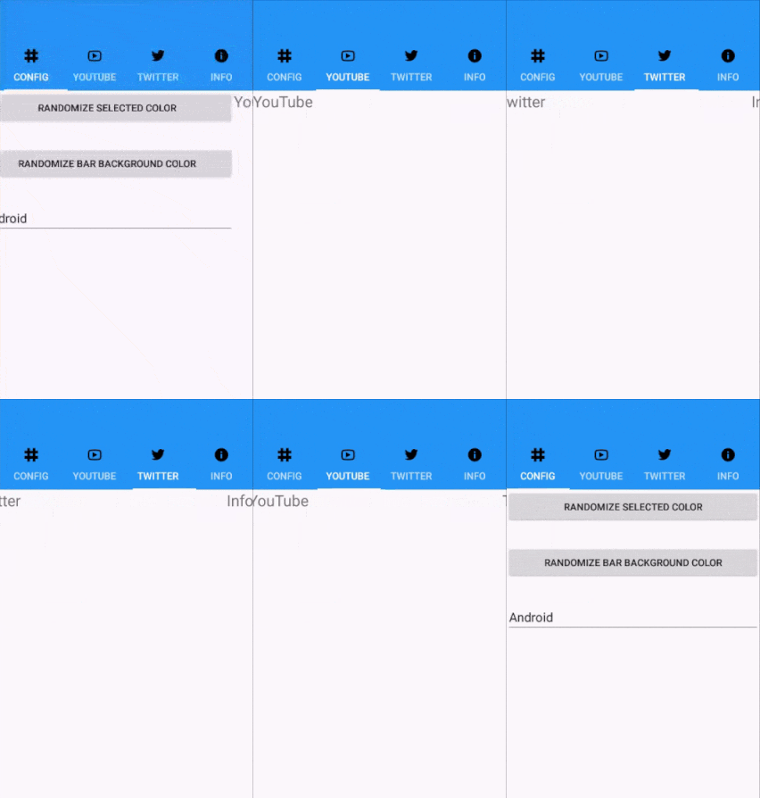
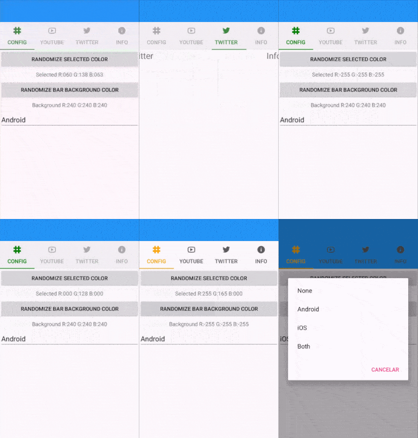
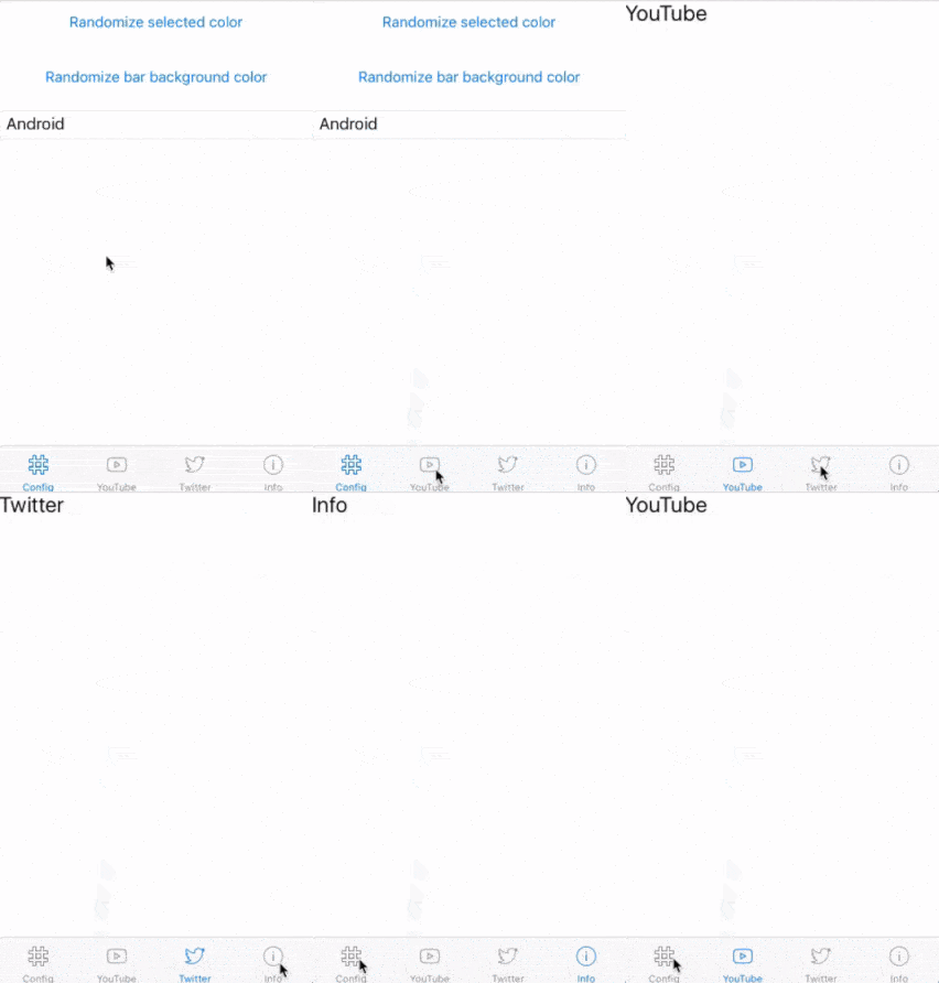
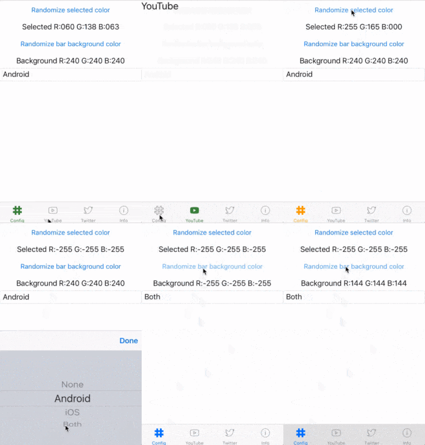
The we would get something like this (on the left is the same page but created with a common TabbedPage:


Dowload the source code so you can see the run and play with the sample app for this post.
And that’s all… now, if you want to know how I managed to deliver this customization, keep on reading.
PlatformTabbedPage
Among the things that I wanted to customize are the color of the selected item, the color of the unselected item, and when in iOS the icon of the selected element becuase as you may have seen in the previous gifs when using Android it is hard to tell at first sight in which page are we on, while in iOS it is a bit weird that the icon of the selected stays the same as the others.
Render creation
Start by defining a class that inherits from the type of page that we are going to customize.
public class PlatformTabbedPage : TabbedPageThen we define the properties, along with its correspondent BindableProperty that will allow these properties to be bindable.
public static readonly BindableProperty SelectedColorProperty =
    BindableProperty.Create(nameof(SelectedColor), typeof(Color), typeof(PlatformTabbedPage), default(Color));

public Color SelectedColor
{
    get { return (Color)GetValue(SelectedColorProperty); }
    set { SetValue(SelectedColorProperty, value); }
}

public static readonly new BindableProperty BarBackgroundColorProperty =
    BindableProperty.Create(nameof(BarBackgroundColor), typeof(Color), typeof(PlatformTabbedPage), default(Color));

public new Color BarBackgroundColor
{
    get { return (Color)GetValue(BarBackgroundColorProperty); }
    set { SetValue(BarBackgroundColorProperty, value); }
}

public static readonly BindableProperty BarBackgroundApplyToProperty =
    BindableProperty.Create(nameof(BarBackgroundApplyTo), typeof(BarBackgroundApplyTo), typeof(PlatformTabbedPage), BarBackgroundApplyTo.Android);

public BarBackgroundApplyTo BarBackgroundApplyTo
{
    get { return (BarBackgroundApplyTo)GetValue(BarBackgroundApplyToProperty); }
    set { SetValue(BarBackgroundApplyToProperty, value); }
}
The property descriptions are the following:
SelectedColor: The color of the selected itemBarBackgroundColor: The background color of the bar, I decided to hide withnewthe default implementation, as I’m going to control the behavior of it inside the custom renderer.BarBackgroundApplyTo: An enum that indicates in which platforms the backround color of the bar needs to be modified, the default is Android, as I consider that in iOS it seems a bit weird setting the background color of the bar.
Apart from that, I created some extension methods that are useful to work with colors, making them darker or lighter, or help deciding whether one color is light or dark.
Now, we are ready to see each platform implementation:
iOS
(this renderer is completely based on the implementation of James Montemagno in the Xamarin’s Evolve App)
In iOS we need to create a renderer that inherits from TabbedRenderer:
public class PlatformTabbedPageRenderer : TabbedRendererAfter that I defined a property to access to the forms instance of PlatformTabbedPage and another couple to store the default colors of the UITabBar:
PlatformTabbedPage FormsTabbedPage => Element as PlatformTabbedPage;
UIColor DefaultTintColor;
UIColor DefaultBarBackgroundColor;
If you have previously written a custom renderer you should know of the importance of the OnElementChanged method, because it is called every time your control is going to be rendered on screen. That is why we assign and unassign an event that will allow us to know whent the properties of the bar in the forms project change.
if (e.OldElement != null)
{
    e.OldElement.PropertyChanged -= OnElementPropertyChanged;
}
if (e.NewElement != null)
{
    e.NewElement.PropertyChanged += OnElementPropertyChanged;
}
Then we get and store the default colors of the UITabBar just in case we need them in the future.
DefaultTintColor = TabBar.TintColor;
DefaultBarBackgroundColor = TabBar.BackgroundColor;
Once the original colors are stored, we call a couple of methods that will assign the desired colors.
SetTintedColor();
SetBarBackgroundColor();
Now it is time to “fill” the icons, and I say “fill” because in reality you need to provide a “filled” version of your icons, one is going to be shown by default while the oter is going to be displayed when the tab is active.
The trick here relies in the fact that the iOS API exposes a property to set an image for each state of a given tab, and that is precisely what this renderer does: takes the original icon, appends the suffix “_active” and sets it aas the image that should be used when the tab is selected:
if (FormsTabbedPage != null)
{
    for (int i = 0; i < TabBar.Items.Length; i++)
    {
        var item = TabBar.Items[i];
        var icon = FormsTabbedPage.Children[i].Icon;

        if (item == null)
            return;
        try
        {
            icon = icon + "_active";
            if (item?.SelectedImage?.AccessibilityIdentifier == icon)
                return;
            item.SelectedImage = UIImage.FromBundle(icon);
            item.SelectedImage.AccessibilityIdentifier = icon;
        }
        catch (Exception ex)
        {
            Console.WriteLine("Unable to set selected icon: " + ex);
        }
    }
}
And basically that’s all, we do not require of anything else thanks to the iOS API.
Android
For the Android renderer we must derive from the TabbedPageRenderer class, yes, we need a different renderer for Android.
public class PlatformTabbedPageRenderer : TabbedPageRendererAgain, we need some properties to store the default colors:
PlatformTabbedPage FormsTabbedPage => Element as PlatformTabbedPage;
AndroidColor _selectedColor = AndroidColor.Black;
AndroidColor DefaultUnselectedColor = FormsColor.Gray.Darken().ToAndroid();
static AndroidColor BarBackgroundDefault;
AndroidColor _unselectedColor = DefaultUnselectedColor;
In Android, a tabbed page is comprised by two elements: A ViewPager and a TabLayout that work together to act as a single control, given the importance for this renderer, we also need to store a class level reference to both elements:
ViewPager _viewPager;
TabLayout _tabLayout;
Now, inside the OnElementChanged method we are going to get the references to the Views declared before. The renderer contains both, but they’re “hidden” as View types, that is why the is operator is used to know which cast to use:
for (int i = 0; i < ChildCount; i++)
{
    var v = GetChildAt(i);
    if (v is ViewPager)
        _viewPager = (ViewPager)v;
    else if (v is TabLayout)
        _tabLayout = (TabLayout)v;
}
We get the default colors for the bar background and then we set our own colors:
BarBackgroundDefault = (_tabLayout.Background as ColorDrawable)?.Color ?? Android.Graphics.Color.Green;
SetSelectedColor();
SetBarBackgroundColor();
Unlike iOS, Android makes use of a couple of methods that are called everytime a tab is selected/unselected, that is why we need to assign them inside our aforementioned method:
_tabLayout.TabSelected += TabLayout_TabSelected;
_tabLayout.TabUnselected += TabLayout_TabUnselected;
To finish overriding of this method, we need to set the color of all icons as unselected, and then mark the firs one as selected:
SetupTabColors();
SelectTab(0);
And to finish this masterpiece, here is the “magic”. In the methods that handle each selection/unselection of tabs we need to apply a color filter to each image, as you can see the color varies depending on the tab being selected or not:
private void TabLayout_TabUnselected(object sender, TabLayout.TabUnselectedEventArgs e)
{
    var tab = e.Tab;
    tab.Icon?.SetColorFilter(_unselectedColor, PorterDuff.Mode.SrcIn);
}

private void TabLayout_TabSelected(object sender, TabLayout.TabSelectedEventArgs e)
{
    var tab = e.Tab;
    tab.Icon?.SetColorFilter(_selectedColor, PorterDuff.Mode.SrcIn);
}
And that’s it, the renderer for Android is slightly more complicated than the iOS one, but it isn’t hard to understand.